CyberChimps Mobile First Pro WordPress Theme 1.2
Wordpress Themes CyberChimps 4.8 (1.8K reviews)
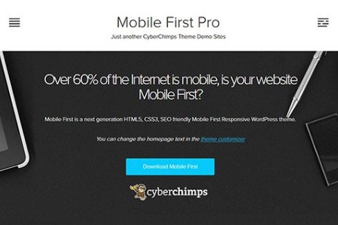
CyberChimps Mobile First Pro is a WordPress theme built by the team at CyberChimps.com for people who want their websites to look great on phones, tablets, and desktop screens alike. The theme arrives as a standard WordPress theme package, delivered as a .zip file, ready for installation through the WordPress admin panel. Its name reflects the core philosophy behind it: mobile-first design. Rather than treating smaller screens as an afterthought, the theme starts from the smallest display and scales upward, making sure every element falls into place naturally. That focus helps site owners avoid the awkward pinching, sideways scrolling, and oversized or undersized text that plague themes not built with mobile users in mind. The result is a site that works naturally at any size. For anyone running a blog, a small business site, or a personal portfolio, this theme aims to remove the guesswork from creating a site that feels right on any device.
Other products to consider

 Themeforest

Responsive behavior sits at the center of what this theme does. A fully responsive layout means the same content reflows and adapts to whatever screen width is available. Menus collapse into mobile-friendly navigation, images scale proportionally, and text remains readable without zooming. The theme also includes an easy-to-use Theme Options Panel, which gives site owners a straightforward way to adjust colors, layouts, and other visual settings without touching code. Instead of digging through template files, a person can make changes from a single interface and see their site update accordingly. This is especially valuable for smaller site owners who do not have dedicated developers on call. That combination of responsive structure and accessible controls makes the theme practical for people who want a polished website but do not necessarily have deep technical knowledge. The result is a theme that handles the heavy lifting of display adjustments while leaving design decisions in the hands of the user.
Customization goes beyond basic color changes. The theme is fully customizable, meaning users can reshape the look and feel of their site to match their brand or personal style. Translation readiness is another built-in feature, so the theme is structured to work well with translation plugins and multilingual setups. This makes it a decent option for site owners who publish content in more than one language or want to reach audiences beyond their immediate borders. The theme's file structure follows standard WordPress conventions, which also helps with child themes and custom modifications. Everything stays editable, and nothing forces the user into a proprietary framework. For developers or hobbyists who like to tinker, that openness is a practical advantage. Because it comes directly from the original author's release, users get an authentic theme package without any third-party alterations. That authenticity matters for anyone who wants a theme that behaves exactly as the developer intended.
Search engine optimization is a stated part of the theme's build. Combined with the mobile-ready layout, the theme aligns well with modern search practices that prioritize mobile usability. The provided .zip file matches exactly what the original developer distributes, so there are no modified files or unexpected extras bundled in. That means the theme should behave the same way it would in a direct purchase from the author, offering the same options and features. For anyone who likes to experiment with different themes before committing to a permanent design, having a clean, untouched copy to test with is genuinely useful. That balance between mobile convenience and desktop usability makes the theme a solid starting point for a wide range of sites. CyberChimps Mobile First Pro delivers a focused, practical approach to WordPress design, built around the needs of mobile visitors without ignoring desktop users.
- Last updated
- August 10, 2026
- Delivery
- Digital
- Availability
- In stock
- Version
- 10.8.9
- Category
- Wordpress Themes
- Item type
- theme
CyberChimps Mobile First Pro WordPress Theme is listed in Wordpress Themes as a theme. The supplied description, preview, version, price, and recorded product details are collected here for review.
Usage rights depend on the license selected at checkout. Review the complete terms before using this item for client work, redistribution, SaaS, or more than one end product.