Eight - Responsive Portfolio HTML5 Template Latest Version
HTML Templates Themeforest 4.8 (645 reviews)
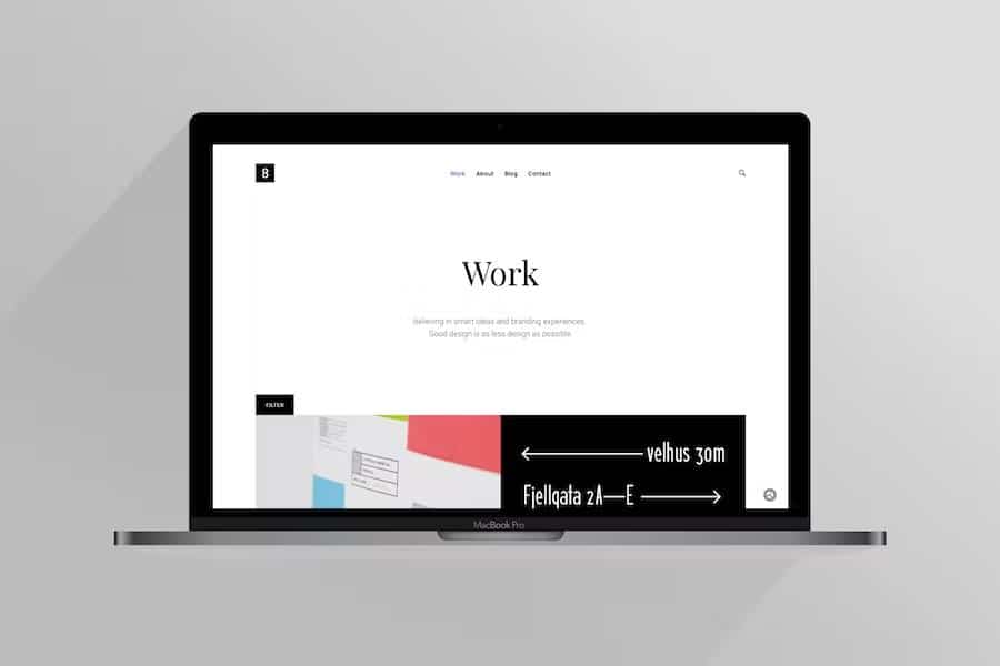
Eight functions as an elegant HTML5 portfolio template built specifically to display creative work online. Designers, illustrators, small agencies, and similar professionals use this digital template to present their projects with clarity and style. Visual presentation matters immensely in creative fields, and this product provides a clean framework that puts images and portfolio pieces front and center. Visitors arrive at a site built with this layout and experience a straightforward browsing structure that keeps their attention focused squarely on the displayed content. Every element within the code prioritizes simplicity, ensuring the final website feels uncluttered and professional from the moment someone loads the page. People building a new portfolio site will find that the foundation provided here requires minimal adjustment to achieve a polished visual result. Setting up pages takes very little time because the layout structure anticipates the basic needs of a creative portfolio right out of the box. Clean typography and well-spaced grid systems allow creative work to speak for itself without unnecessary visual distractions getting in the way of the viewer experience.
Similar products
 Themeforest
Responsive design principles guide the architecture of this template, making sure pages adapt smoothly to different screen sizes. Mobile phones, tablets, and desktop computers all display the layout accurately, which helps maintain a consistent user experience regardless of the hardware visitors use. Media queries built into the underlying CSS handle the heavy lifting of rearranging elements as viewport dimensions shift during browsing. Images scale correctly inside their containers, preventing awkward cropping or distortion that might otherwise ruin the presentation of detailed design work. Navigation menus adjust automatically for smaller touch screens, offering an intuitive way to browse categories and project pages on the go. Testing across various devices confirms that page elements remain accessible and visually appealing without requiring extra configuration from the site builder. This responsive behavior ensures potential clients or employers viewing work from a smartphone enjoy the exact same high-quality layout presentation as someone sitting at a large desktop monitor in an office.
HTML5 and CSS3 form the technical backbone of this template, utilizing modern web standards for reliable performance. Clean markup allows developers and designers to modify the source code easily, adding custom styles or adjusting existing structures to match specific branding needs. Standardized tags improve semantic organization, making the underlying structure easy to read for anyone familiar with basic web development languages. Cascading style sheets control colors, fonts, and spacing through organized blocks of rules that accept quick modifications. Browser compatibility receives strong attention in the underlying code, ensuring pages load correctly across major desktop and mobile software options currently available on the market. Lightweight scripts keep page load times fast, reducing the frustration visitors often feel when waiting for heavy media assets to appear on screen. Anyone with foundational knowledge of web markup can open these files in a standard text editor and begin making personalized changes immediately.
Project pages, gallery grids, and contact sections come pre-arranged within the template structure to cover standard portfolio requirements. Visual layouts prioritize large image placements alongside brief descriptive text areas, giving creators enough room to explain their design process or project goals. Contact forms and social media link placements give visitors a direct way to reach out for business inquiries or networking opportunities after viewing the featured work. Organizing projects into distinct categories helps larger portfolios remain manageable for visitors who want to filter content by specific skills or mediums. Standard page templates reduce the effort required to publish new case studies as creative careers progress and fresh work needs to be added to the live site. Simple file organization on the backend ensures that swapping out placeholder images and updating text content happens quickly during initial setup. Overall, this HTML5 template delivers a practical, well-structured starting point for anyone needing a dependable online home for their creative portfolio.
- Last updated
- August 14, 2026
- Delivery
- Digital
- Availability
- In stock
- Version
- Latest Version
- Category
- HTML Templates
- Item type
- template
Eight - Responsive Portfolio HTML5 Template appears in the HTML Templates catalog and is classified as a template. The page focuses on information available in the listing rather than unsupported performance or compatibility claims.
Usage rights depend on the license selected at checkout. Review the complete terms before using this item for client work, redistribution, SaaS, or more than one end product.