Ever+ | Responsive Multi-purpose HTML Template Latest Version
HTML Templates Themeforest 4.8 (4.6K reviews)
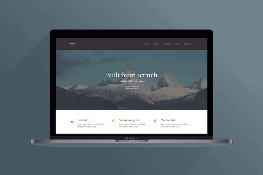
Ever+ is an HTML template built for people who want a professional website without starting from a blank page. Its design is clean and modern, but deliberately neutral enough to suit many different kinds of projects. You could use it for a personal portfolio, a corporate site, a creative agency’s homepage, or an app landing page, and it would still look like it was made for that purpose. The layout feels considered rather than generic, with attention to spacing, alignment, and typography. Nothing about the design forces your content into a narrow style. Instead, the template provides a solid foundation that you can adapt to your own needs. Reusable components mean you can build out full pages quickly, and the overall structure stays consistent no matter which sections you choose. That flexibility is a central part of its appeal, because it means you are not locked into one industry or aesthetic.
Related products
 Themeforest
The code behind Ever+ is organized and well commented, which makes it approachable for developers who need to customize things. Pages are built from reusable components, so you can add or remove sections without breaking the overall structure. You get several homepage layouts, distinct inner-page styles, and a typography system that keeps text readable across screens. The component library includes galleries, portfolio grids, service sections, pricing tables, and generic content blocks. Because the structure is modular, you decide which pieces to use and how to order them. You can even mix and match sections to create a layout that fits your specific content. Styling adjustments like colors and spacing are available without editing core files, meaning you can give the site your own feel while keeping the underlying code intact. This modular approach keeps the template flexible without making the code difficult to follow. The result is a system that works for both beginners and experienced builders.
This template is made for a wide range of people. Photographers and illustrators can present their work in a visually driven way, while designers can use it as a portfolio that highlights their projects. Freelancers and consultants can set up a simple professional profile with services and contact details. Businesses can adapt it to advertise products, describe services, or tell their story. All of this happens without needing separate design approaches, because the modular sections work together naturally. The design language itself is understated and elegant, letting your content stand out instead of competing with flashy graphics. Even if you have no coding experience, the logical structure and clear documentation make it possible to assemble a polished site on your own. The template does not impose a particular style, so your work remains the focus. That makes it just as useful for a single-page profile as for a multi-section business site.
Mobile visitors receive the same care as desktop users. The layout adjusts fluidly across phones, tablets, and larger monitors, with touch-friendly controls and text that stays readable at any size. Images scale properly, menus turn into accessible navigation patterns, and nothing feels cramped on a small screen. Each element gets enough breathing room, so scrolling feels natural whether someone is using a mouse or a finger. Pages retain their visual structure from a small phone up to a wide desktop, so there is no jarring shift in layout. The goal is simple: no matter how a visitor arrives, they see a consistent, polished experience. The template is designed around real use, not just looks, which is why even the smallest screens feel controlled and deliberate. For anyone who wants a dependable website without building everything from nothing, Ever+ offers a practical starting point that respects your time and lets you focus on the content that matters.
- Item type
- template
- Category
- HTML Templates
- Version
- Latest Version
- Availability
- In stock
- Delivery
- Digital
- Last updated
- August 2, 2026
Ever+ | Responsive Multi-purpose HTML Template is one of the HTML Templates items recorded as a template. The content below uses the supplied listing information and current local catalog data.
Usage rights depend on the license selected at checkout. Review the complete terms before using this item for client work, redistribution, SaaS, or more than one end product.