Flatly - Multi Store Responsive Shopify Theme Latest Version
Shopify Themes Themeforest 4.8 (4.6K reviews)
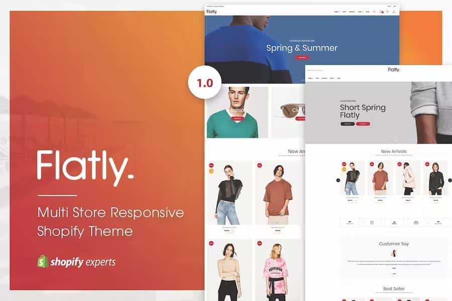
Flatly is a flexible Shopify theme designed for building online stores across multiple retail categories. Store owners can sell clothing, electronics, video games, specialty foods, and household appliances using this single template. Visual layout adjustments happen through a sectioned drag and drop builder that requires zero coding knowledge. Page elements snap into place naturally, allowing creators to construct custom layouts for homepages, product pages, and category archives within minutes. Visual hierarchy remains clean and readable, keeping customer attention focused squarely on merchandise photography and purchasing details. Every pixel scales down properly on smartphones, tablets, and desktop monitors. High-resolution screens display crisp typography and sharp product badges without pixelation or layout shifts. Merchants gain access to multiple header and footer style options to match their brand identity. Color pickers supply unlimited palette choices for backgrounds, buttons, and accents. Typography selections draw directly from Google Fonts, giving site managers hundreds of distinct lettering styles to pick from. Standard branding elements like logos and favicon images upload directly through the customizer panel. Layout variations provide alternative grid and list views for displaying inventory across collections. Shoppers browse through large promotional banners powered by a built-in slider tool designed to highlight seasonal collections or discount events. Blog post sliders help brands share styling tips, company news, and buying guides directly on their storefronts.
Navigation tools help buyers find specific inventory quickly through advanced layered navigation and built-in mega menus. Dropdown menus accommodate complex product hierarchies without cluttering the main screen. Shoppers filter items by attributes like price, color, and size instantly. Product grids feature automatic price updates whenever variations change, preventing customer confusion during selection. Interactive category pages include pagination tools and sorting toolbars that keep browsing fast and orderly. Badge labels highlight specific merchandise statuses such as new arrivals, hot items, or discounted goods. Individual product pages organize specifications clearly using tabbed sections that separate descriptions from reviews and technical details. Additional information tabs display specific attributes for complex goods. Image carousels let shoppers inspect multiple angles of a single item without reloading the page. Instagram image sliders pull social media feeds directly into the storefront to showcase user-generated content and real-world product styling. Customer review sections build social proof by allowing buyers to share feedback and ratings directly on product pages. Social networking links connect visitors to brand profiles across various external platforms.
Other products to consider
 Themeforest
Shopping cart interactions happen smoothly using modern Ajax technology. Buyers add items to their cart or wishlist without enduring full page reloads, keeping the shopping momentum active. A convenient drawer cart slides out from the header whenever users want to review their running total, view selected sizes, or proceed toward checkout. Background scripts handle currency conversions automatically, letting international shoppers view prices in familiar monetary units. Search engines index store content efficiently thanks to built-in optimization practices integrated directly into the markup. HTML5, CSS3, and Sass CSS form the technical foundation, ensuring the codebase remains clean, fast-loading, and compatible with modern web browsers. FontAwesome icons provide lightweight graphical elements for buttons, cart symbols, and navigation arrows. Back-to-top buttons help users return to the main header after scrolling through long product listings.
Getting a new storefront online starts with a one-click import feature that populates the layout with sample content and structure. Store administrators populate their inventory quickly by matching their product data to the existing theme architecture. Documentation files explain each configuration option in detail, guiding operators through color adjustments, menu setups, and widget placements. Cross-browser testing guarantees consistent performance across major desktop and mobile web applications. Store operations run smoothly day and night because the underlying structure maintains stability under heavy traffic loads. Merchants manage their digital storefronts efficiently without needing external developers for basic visual updates or routine maintenance tasks. Clean separation of concerns between design elements and inventory data keeps the administrative backend organized and straightforward to manage over the long term.
- Item type
- theme
- Category
- Shopify Themes
- Version
- Latest Version
- Availability
- In stock
- Delivery
- Digital
- Last updated
- August 15, 2026
Flatly - Multi Store Responsive Shopify Theme appears in the Shopify Themes catalog and is classified as a theme. The page focuses on information available in the listing rather than unsupported performance or compatibility claims.
Usage rights depend on the license selected at checkout. Review the complete terms before using this item for client work, redistribution, SaaS, or more than one end product.