Gazeta 1 - Responsive Magazine & News Template Latest Version
HTML Templates Themeforest 4.8 (768 reviews)
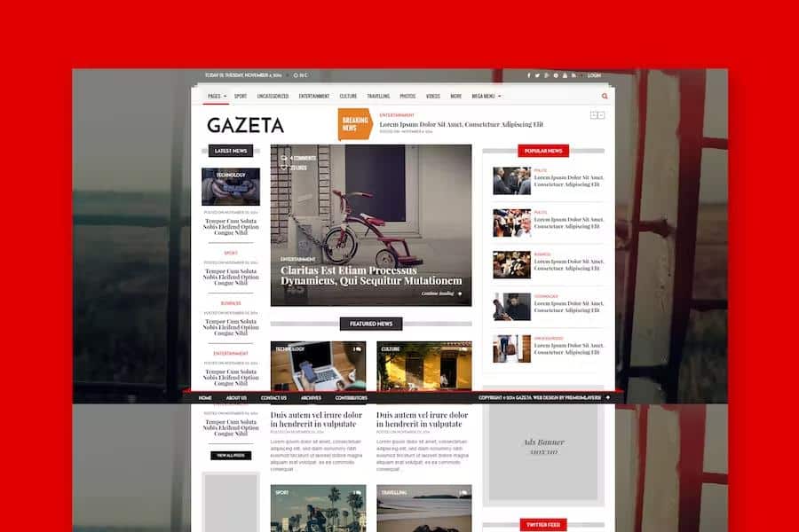
Gazeta 1 is a responsive magazine and news template designed for publishing content online across desktop computers, tablets, and smartphones. Built using the Bootstrap framework, the layout adapts automatically to different screen resolutions and viewing devices. Readers browsing from mobile phones experience the same structural clarity as visitors using large desktop monitors. Clean code forms the foundation of this template, making the underlying structure easy for developers and site administrators to read, maintain, and adapt. Every component relies on modern web standards to ensure fast loading times and reliable performance on standard servers. Publishers focusing on journalism, blogging, or editorial curation find that the arrangement of elements places strong emphasis on written articles and accompanying visuals. Setting up the layout requires minimal technical knowledge, allowing users with basic web editing experience to launch a professional publication quickly. The visual presentation avoids unnecessary clutter, keeping the focus entirely on the stories and information published on the site.
Visual styling incorporates CSS3 effects and animations that add subtle movement and polish to page transitions without slowing down browser performance. Font Awesome icons are integrated directly into the template files, providing vector symbols for navigation menus, social media links, and interface controls. Typography relies on Google Web Fonts, giving site owners access to a diverse library of readable typefaces that render clearly on high-density displays. A filterable portfolio section allows publishers to organize and display visual media projects, photography collections, or categorized article archives in an interactive grid format. Users can sort through items instantly based on specific tags or categories without reloading the page. Each styling element is organized logically within the style sheets, permitting straightforward color changes and font adjustments for anyone familiar with basic CSS editing. The design philosophy prioritizes readability above all else, ensuring that long-form journalism and daily news updates appear sharp and structured.
Other products to consider
 Themeforest

A functional contact form comes pre-coded within the package, enabling visitors to send inquiries, feedback, or news tips directly to the site administrators. Integration with Google Maps is also included, providing a visual way to display geographic locations, office addresses, or event venues on contact and about pages. These built-in components save time during the initial setup phase because developers do not need to code standard interactive forms from scratch. The underlying markup adheres to clean design practices, ensuring search engines can crawl and index textual content efficiently. Documentation is provided to guide users through the initial installation process and explain how the various template components fit together. While demonstration images visible in promotional screenshots are excluded from the final download archive, placeholder areas make inserting custom photography and graphics straightforward. Every functional piece works together harmoniously to establish a complete foundation for an online publication.
Managing day-to-day updates on a news website requires a template that handles frequent content additions smoothly, and this layout accommodates varying story lengths effortlessly. Articles can feature prominent lead images, author bylines, publication dates, and category tags to help readers navigate through large volumes of published material. The responsive grid system ensures that multi-column layouts shift naturally into single-column feeds on smaller screens, preserving legibility everywhere. Site owners can adapt the visual styling to match specific branding requirements by modifying the included style sheets. Standard web browsers render all elements consistently, reducing the time spent troubleshooting cross-browser compatibility issues after launch. Editorial teams seeking a straightforward, reliable publishing framework will find that this template provides all necessary structural elements without excessive bloat or complicated configuration steps. Simplicity and ease of use remain central to the architecture, making the layout accessible for independent bloggers and small publishing teams alike.
- Last updated
- August 2, 2026
- Delivery
- Digital
- Availability
- In stock
- Version
- Latest Version
- Category
- HTML Templates
- Item type
- template
Gazeta 1 - Responsive Magazine & News Template appears in the HTML Templates catalog and is classified as a template. The page focuses on information available in the listing rather than unsupported performance or compatibility claims.
Usage rights depend on the license selected at checkout. Review the complete terms before using this item for client work, redistribution, SaaS, or more than one end product.