Gmera - Multipurpose Mobile Template Latest Version
HTML Templates Themeforest 4.8 (511 reviews)
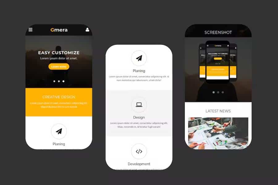
Gmera is a flexible mobile template built with a fresh and clean aesthetic tailored for smartphone and tablet screens. Creators can use this digital asset to build mobile sites for company profiles, small business presentations, personal portfolios, and various commercial niches. Every layout element is structured to adapt cleanly to touch interfaces, giving visitors a smooth browsing experience regardless of their device brand. Developers constructed the package using standard web technologies, making it straightforward to inspect the source code and modify existing styles. Standard page layouts are included out of the box so you can assemble a complete mobile presence quickly without starting from a blank canvas. Visual elements rely on modern styling rules that load efficiently on cellular networks, helping pages appear fast on mobile browsers. Anyone building a mobile project needs a solid foundation that looks professional right away, and this template provides that exact starting point for your next development task.
Customizing the visual appearance requires basic knowledge of HTML and CSS, allowing you to swap out default colors and typography to match your branding. Font Awesome icons are integrated directly into the files, giving you access to a large library of scalable vector graphics for buttons, menus, and contact blocks. The responsive grid system automatically rearranges content containers based on screen dimensions, ensuring text and images never spill off the edges of smaller displays. Portfolio pages feature structured grid layouts designed to showcase photography, design work, or project galleries in a tidy format. Blog templates help you publish articles and news updates with clean typography that remains readable on compact screens. Standard shop layouts are also built into the core files, providing product grids and single-item pages for displaying merchandise items clearly. Each section connects logically to the rest of the template, maintaining a consistent visual theme throughout the entire user journey.
Working contact forms are included to help site visitors send inquiries directly from their mobile devices without needing external plugins or complex backend scripts. Documentation files accompanying the main download explain how the folders are organized and outline the steps required to edit the source code properly. Code comments are placed strategically within the markup files to guide developers through specific sections and layout modules. Standard navigation menus function reliably across different mobile operating systems, providing quick access to inner pages through familiar toggle patterns. Standard image placeholders show you exactly where to insert your own visual assets to maintain proper aspect ratios across different screen sizes. Footer areas include space for social media links, copyright notices, and secondary navigation items to round out the bottom of each page. Every component was assembled with simplicity in mind, avoiding bloated scripts that often slow down mobile browsing speeds on standard cellular connections.
Other products to consider

 Themeforest
Building a mobile presence for a business or portfolio becomes much simpler when the layout structure is already tested and proven on touch screens. This template eliminates the need to design every single button and navigation bar from scratch, saving valuable time during the early phases of development. Freelancers and digital agencies often keep templates like this on hand to prototype ideas rapidly for clients who need to see a working mobile concept before final approval. Code standards followed during development ensure that future modifications remain straightforward for anyone familiar with standard web authoring tools. Clear folder structures separate stylesheets, script files, and image assets so you can locate specific items instantly during editing sessions. Standard browser compatibility is maintained across major mobile platforms, reducing unexpected layout shifts during everyday usage. Reviewing the included files gives you complete control over the final presentation of your content, allowing you to deploy a polished mobile site efficiently.
- Item type
- template
- Category
- HTML Templates
- Version
- Latest Version
- Availability
- In stock
- Delivery
- Digital
- Last updated
- August 15, 2026
The Gmera - Multipurpose Mobile Template listing is available in HTML Templates as a template. Check the description, item facts, and purchase details to assess its relevance to a project.
Usage rights depend on the license selected at checkout. Review the complete terms before using this item for client work, redistribution, SaaS, or more than one end product.