Hombre - Responsive Coming Soon Page Latest Version
HTML Templates Themeforest 4.8 (497 reviews)
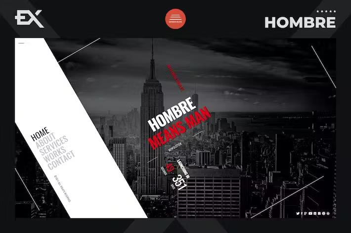
Hombre functions as a fully responsive under construction and coming soon HTML template featuring a modern design aesthetic suited for various creative fields. Photographers, artists, and designers can use this template to showcase their portfolios while they build their full websites. The layout supports a fullscreen background video alongside high-resolution imagery to capture visitor attention immediately upon arrival. Built using the Bootstrap framework, the template delivers clean semantic HTML and well-structured CSS that adapts fluidly to different screen sizes and viewing devices. Setting up a placeholder page takes minimal effort thanks to the straightforward file organization and properly commented code files included in the package. Developers and site owners find the structural design intuitive, allowing for quick adjustments to text, styling, and media assets without digging through messy markup. Every component adheres to current web standards, ensuring fast loading times and reliable performance across major modern web browsers. Visual elements maintain their proportions on desktop monitors, tablets, and smartphones alike, giving visitors a polished viewing experience no matter how they access the page.
Customization options give users the flexibility to match their personal brand identity or company color scheme with very little effort. Editing the source files requires only basic familiarity with HTML and CSS, making the template accessible to beginners and experienced web creators alike. The background video feature brings motion and life to a simple placeholder screen, turning a standard static landing page into an engaging visual presentation. Projects requiring a striking visual introduction benefit greatly from the media-focused layout that places creative work front and center. Creators can display a curated selection of their best photographs or design pieces directly on the screen while collecting email addresses from interested visitors. Subscription forms integrate smoothly with popular mailing list services, helping site owners build an audience before the main web project officially launches. Social media icons provide direct links to external profiles, connecting prospective clients and fans to existing online channels instantly.
Related products
 Themeforest

Technical implementation relies on a solid foundation of Bootstrap components, grids, and utility classes that simplify layout modifications. Designers wanting to adjust padding, margins, or color variables can do so through the main stylesheet without breaking the responsive grid system. The code formatting follows industry best practices, presenting clear indentation and descriptive comments that explain the purpose of each section. Setting up the files on a web hosting server involves simply uploading the package contents via an FTP client or control panel file manager. No complex database setup or server-side scripting knowledge is required to get the page running, as the template consists purely of static front-end assets. This simplicity reduces potential security vulnerabilities and hosting requirements, allowing the placeholder site to run efficiently on basic shared hosting accounts. Maintenance is virtually nonexistent once uploaded, freeing up time for creators to focus entirely on finishing their primary web presence.
Visitors landing on the page encounter a clean typography system that pairs well with photography and creative portfolios. Readability remains high across all viewports due to careful scaling of font sizes and line heights within the responsive framework. Navigation elements, subscription fields, and social links sit harmoniously on top of the fullscreen background media without obscuring important visual details. The overall user experience focuses on speed, clarity, and aesthetic appeal, establishing a professional first impression for any upcoming brand or project. Anyone needing a reliable, attractive, and media-friendly placeholder page will find this template provides all the necessary structural elements out of the box. Acquiring the template grants access to the complete set of HTML, CSS, JavaScript, and media asset files ready for deployment on any standard web server. The project remains a practical solution for creative professionals seeking to establish an online presence quickly while their full web portfolio undergoes development.
- Item type
- template
- Category
- HTML Templates
- Version
- Latest Version
- Availability
- In stock
- Delivery
- Digital
- Last updated
- September 8, 2026
Hombre - Responsive Coming Soon Page belongs to the HTML Templates section and is treated as a template. Its preview, description, and listing facts can be checked without adding claims not found in the source.
Usage rights depend on the license selected at checkout. Review the complete terms before using this item for client work, redistribution, SaaS, or more than one end product.