Lydia - Photography Latest Version
HTML Templates Themeforest 4.8 (4.0K reviews)
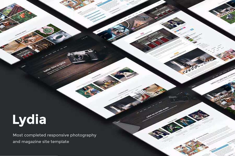
Lydia is a photography and magazine HTML5 template for showcasing visual work without wrestling with complicated setup. It was built with Twitter Bootstrap 3, so the grid, typography, and interactive components behave predictably across projects. The template is aimed at photographers, artists, creative agencies, digital studios, bloggers, freelancers, and business owners who want a portfolio that looks put together from the start. Every page adapts to the viewer's screen, shifting the layout from a phone to a tablet to a desktop monitor without losing structure. That responsive foundation is part of how the template works, not a separate add-on. There are thirty-plus HTML5 pages and eleven color options, letting you alter the mood of the site without rebuilding anything. The visual direction is clean and magazine-like, giving images space while keeping text readable and navigation clear. Even the blog-focused pages follow that same visual language, so the entire site holds together.
Lydia ships with eight different home layouts, so the front page can be arranged in several ways. A one-page option condenses everything into a scrolling experience, and an ajax portfolio loads project details without refreshing the browser. Three header styles change how menus and branding appear across the site. The eleven color schemes are available alongside filterable portfolio sections, so galleries can be organized by category or project type. Blog layouts come in several shapes, which is handy if you publish journals, case studies, or news alongside your work. On touch screens, swipe support works naturally for moving through images. The portfolio itself can be framed in different ways, from tight grid arrangements to more spacious presentations. If you prefer a magazine structure over a standard gallery, the template accommodates that too. This kind of flexibility matters for photographers and studios whose presentation needs evolve, since it lets you keep the same site while adjusting the structure rather than starting over.
Other products to consider

 Codecanyon
Three premium scripts are bundled with the template. Cube Portfolio powers the interactive gallery grids, Revolution Slider adds full-width slideshows for hero sections, and Vanilla Form handles the contact form. These tools are normally sold separately, but they are included here. Parallax effects can be applied to both images and video, which gives the pages a layered sense of depth. The graphics and icons are retina-ready, so they stay sharp on high-density displays like modern phones and laptops. Google Fonts and the styling controls handle typography and spacing. The template is jQuery enhanced, meaning menus, sliders, and gallery transitions feel smooth when you click through. The code validates as HTML5 and CSS3 and is compatible across the major browsers, so you do not need to worry much about edge-case rendering. This combination covers the essentials of a media-heavy website: an attractive slideshow, organized galleries, a working contact page, and a layout that holds together on almost any browser.
The everyday parts of a photography site are handled too. The contact form submits without refreshing the page, so visitors can send messages and keep browsing. Mailchimp integration collects newsletter sign-ups, while Instagram and Flickr feeds pull recent posts directly into the template. Google Maps can be placed on the contact page, and footer widgets hold extra links, recent entries, or social profiles. The template was built with search engines in mind, and the clean markup makes it easier for page content to be understood. Valid HTML5 and CSS3, combined with cross-browser compatibility, keep things stable for different visitors. Help documentation walks through setup and common customizations, and free updates and support come with the template. All of this sits on the same responsive framework, so smartphone, tablet, and desktop visitors each get a layout sized for their screen. The result is a complete starting point for a photography or magazine site, with the major features already assembled.
- Last updated
- August 14, 2026
- Delivery
- Digital
- Availability
- In stock
- Version
- Latest Version
- Category
- HTML Templates
- Item type
- template
The Lydia - Photography listing is available in HTML Templates as a template. Check the description, item facts, and purchase details to assess its relevance to a project.
Usage rights depend on the license selected at checkout. Review the complete terms before using this item for client work, redistribution, SaaS, or more than one end product.