Maker Mail - Responsive E-mail Template + Online Access Latest Version
HTML Templates Themeforest 4.8 (4.0K reviews)
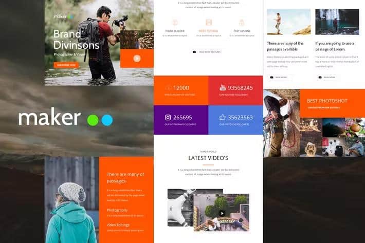
Maker Mail is a digital email template designed for creators, developers, and small business owners who need a clean foundation for their outbound messaging. This product provides a modern layout that adapts to different screen sizes, ensuring your recipients can read your announcements, newsletters, and updates clearly on mobile phones, tablets, and desktop computers alike. Along with the ready-to-use HTML template files, buyers receive online access to manage their project assets and view documentation. The visual style avoids clutter, prioritizing readability and direct communication over distracting design elements. You can insert your own text, swap out links, and adjust the structure to match your brand identity without needing advanced coding knowledge. Building an email campaign often takes hours of trial and error with raw HTML and CSS, but this layout removes the heavy lifting by providing a pre-coded structure that renders properly across many popular desktop and mobile mail clients.
Compatibility is a major focus of this template, and the codebase has been tested extensively across common email software to minimize layout breakage. Major webmail clients and desktop applications display the structural elements accurately, meaning your headers, body text, and call buttons stay aligned for most readers. The package includes integration support for prominent email marketing service providers such as Mailchimp, Campaign Monitor, iContact, and Stampready. This integration means you can import the raw template directly into your preferred sending platform and map your audience data fields with minimal setup friction. Designers also get access to the underlying PSD source files, allowing you to edit visual elements, adjust color palettes, or rearrange graphic components using Adobe Photoshop before exporting final assets for your campaigns. Well-structured documentation is bundled in the download to guide you through the process of editing the code and uploading your final files into your chosen delivery service provider without confusion.
Every digital product comes with specific technical boundaries, and knowing these limitations helps prevent formatting issues during your campaign creation process. Desktop versions of Microsoft Outlook and the Gmail application for Android do not support background images within this specific layout structure, meaning solid background colors display as fallbacks instead. Microsoft Outlook also handles certain padding and margin tags differently than standard web browsers, so testing your emails inside the platform client before sending a mass blast remains a smart precaution. Preview images shown in promotional galleries are intended for demonstration only and are excluded from the main download package to comply with licensing agreements. You will need to supply your own photography, product shots, or graphic banners to populate the image placeholders built into the layout. Understanding these operational boundaries ensures you can plan your content strategy effectively and avoid unexpected visual surprises when your newsletter lands in your subscribers individual inboxes.
Other products to consider
 Themeforest
Setting up your first campaign using Maker Mail involves unzipping the downloaded archive, reviewing the included documentation folder, and opening the HTML file in a standard text editor. From there, you replace the placeholder text with your own copy, insert your specific hyperlink URLs, and reference your hosted image files by updating the image source paths. Once your content edits are finished, you can copy the final HTML code directly into your email marketing platform or use the provided Stampready compatibility files to manage your project online. The responsive grid structure adjusts automatically based on the viewport width of the device reading the message, stacking columns neatly on narrow mobile screens while displaying multi-column layouts on wider desktop monitors. This flexibility ensures your audience receives a consistent visual experience regardless of whether they check their mail on an iPhone, iPad, Apple Mail, Yahoo Mail, or a traditional browser interface. By handling the underlying technical quirks of email design, this package lets you focus entirely on writing engaging content and building better relationships with your customer base.
- Last updated
- August 2, 2026
- Delivery
- Digital
- Availability
- In stock
- Version
- Latest Version
- Category
- HTML Templates
- Item type
- template
Listed under HTML Templates, Maker Mail - Responsive E-mail Template + Online Access is a template. This presentation keeps the product name and recorded facts intact while organizing the details for easier review.
Usage rights depend on the license selected at checkout. Review the complete terms before using this item for client work, redistribution, SaaS, or more than one end product.