Mobi - Mobile First WordPress Responsive Navigation Menu Plugin 3.0
Wordpress Plugins Codecanyon 4.8 (4.3K reviews)
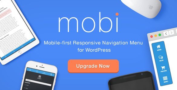
Mobi is a WordPress plugin that creates a responsive navigation menu designed for mobile visitors first. Instead of adapting a desktop menu to smaller screens, it gives you a dedicated mobile menu interface that you can place at the top or bottom of the viewport. Both options are easy to set up, and the menu stays fully functional whether someone is browsing on a phone, tablet, or desktop. The plugin is retina ready, so text and icons remain crisp on high-resolution displays. It connects to your standard WordPress menu system, which means you can choose which existing menu should appear as the mobile version. The display is customisable, and you have control over the menu's appearance and behavior without touching theme files. This gives you a separate navigation path for mobile users, allowing them to browse your site with less effort. That helps where a traditional menu takes up too much space or feels clumsy on a small screen.
Other products to consider
 GravityView
The plugin includes a full overlay popup navigation mode. When a visitor taps the menu button, the screen is covered by a full-screen overlay containing the menu items. This approach gives you plenty of space to present links and avoids the cramped dropdowns common on smaller devices. Several animation options control how the overlay appears and how the menu items come into view. You can choose from different transition effects for the overlay itself and for individual items, so the menu can feel smooth or playful depending on your site's personality. Mobi also supports drag-and-drop menu item customization. You can reorder items directly in the menu editor by dragging them into place, which makes building a mobile menu much faster than entering values by hand. Every menu item can be customised in terms of its label, link, and appearance, giving you full control over what visitors see and where they go next.
Social media links can be added directly to the mobile menu, so visitors do not have to hunt for profiles elsewhere. A dedicated social navigation section lets you place icons for popular networks and have them appear alongside regular menu items. You also get custom Google Font options for the menu text, making it easy to match your site's typography. The included icon library holds more than 700 icon fonts that can be used for menu items, social links, and other visual elements. Display customisation covers colors, sizes, spacing, and alignment, all managed from the plugin settings. A user visibility option decides who sees the mobile menu: everyone, guests only, or logged-in users only. That last setting helps when you run a membership site or want to hide navigation from unauthenticated visitors. These links can be styled to match the rest of the menu. The combination gives you a mobile menu that feels like a natural part of your site rather than an afterthought.
Mobi is tested across modern browsers and devices, so it consistently keeps its layout intact whether someone uses Safari on an iPhone, Chrome on an Android tablet, or Firefox on a desktop computer. The plugin responds to the viewport size and adjusts the menu display accordingly, making it a reliable choice for sites with mixed visitor traffic. Because everything is controlled from the WordPress admin area, you do not need to write code or modify your theme. The menu integrates with the native WordPress menu system, so you can build and update it using familiar tools. For site owners who want a mobile navigation solution without rebuilding their theme, Mobi provides a straightforward way to deliver a functional menu that works the same way across different setups. The combination of positioning options, overlay display, animation effects, and customisation settings gives you a range of choices while keeping the plugin practical to manage.
- Item type
- plugin
- Category
- Wordpress Plugins
- Version
- 1.5.4
- Availability
- In stock
- Delivery
- Digital
- Last updated
- August 9, 2026
Mobi - Mobile First WordPress Responsive Navigation Menu Plugin is cataloged as a Wordpress Plugins under plugin. Review the preview and recorded details alongside the original description before purchase.
Usage rights depend on the license selected at checkout. Review the complete terms before using this item for client work, redistribution, SaaS, or more than one end product.