Rudermann - Responsive Retina Ready HTML Template Latest Version
HTML Templates Themeforest 4.8 (2.9K reviews)
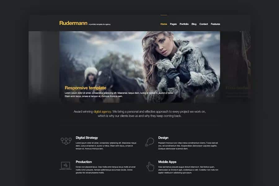
Rudermann functions as a responsive HTML template built on top of the Twitter Bootstrap grid system. This foundation provides a solid structural base for developers and designers who want to build a professional website from scratch. Every single element inside the package undergoes careful design to ensure pixel perfection across standard screens and high-resolution panels alike. Support for Retina displays guarantees that graphical assets, typography, and layout borders remain crisp on devices such as iPhones, iPads, and modern MacBooks. Freelancers, web development agencies, and creative studios find this layout particularly useful for publishing portfolio pieces and service offerings. Coded with clean HTML5 and CSS3 standards, the project files offer a maintainable architecture for custom styling and structural modifications. Designers receive layered Photoshop source files alongside the standard code documents, permitting thorough visual adjustments before starting the actual frontend coding process. Multiple layout variants give you options for setting up the initial visual tone of the site according to specific project preferences.
Two distinct visual themes ship with the template, giving buyers the choice between a dark original aesthetic and a clean light version. This duality allows the overall mood of the published site to match the specific branding requirements of any creative agency or individual designer. Visual presentation takes center stage through the inclusion of several advanced slider and gallery components. A hero carousel slider handles primary banner displays at the top of the page, while a specialized three-dimensional slider adds dynamic motion to featured content areas. FlexSlider 2 integration provides reliable image and content rotation across various sections of the site. Media galleries benefit from an integrated lightbox clone that enlarges images and videos smoothly when clicked by visitors. Portfolio layouts rely on an isotope filtering script that lets users sort through creative work items by category without requiring page reloads. These built-in interactive tools save hours of manual development time by offering pre-configured JavaScript behaviors right out of the box.
More from this category
 Themeforest
Typography and icon graphics receive significant attention through a collection of over two hundred fifty font icons ready for immediate deployment in menus, buttons, and feature lists. These scalable vector symbols maintain sharp edges at any display size and reduce page load times compared to traditional image icons. Functional elements also include a working contact form that helps site visitors send inquiries directly to the website owner. A built-in countdown timer component provides visual tracking for upcoming product launches, event dates, or special announcements. Shortcodes are sprinkled throughout the codebase to simplify the insertion of common layout elements without writing complex markup manually. Organizing text and media becomes straightforward thanks to the modular grid layout inherited from the underlying framework. Each template page maintains fluid scaling properties, ensuring content reorganizes smoothly as screen dimensions change from desktop monitors down to mobile phone viewports.
Adapting this template to a specific brand identity involves replacing placeholder text, swapping out sample imagery, and adjusting color styles within the provided stylesheet documents. Developers familiar with standard web development workflows can easily integrate these templates into content management systems or static site generators. The inclusion of source design files bridges the gap between initial mockup creation and final code deployment for multi-person teams. Code comments within the markup guide users through the process of modifying structural components and adjusting script parameters. Attention to browser compatibility ensures the layout renders consistently across current versions of major web browsing software. Minimalist styling choices direct the focus of visitors toward the showcased creative portfolio items rather than distracting visual clutter. Building a professional web presence for a design studio or independent contractor becomes an approachable task with this structured collection of markup, styles, and scripts.
- Last updated
- September 4, 2026
- Delivery
- Digital
- Availability
- In stock
- Version
- Latest Version
- Category
- HTML Templates
- Item type
- template
Listed under HTML Templates, Rudermann - Responsive Retina Ready HTML Template is a template. This presentation keeps the product name and recorded facts intact while organizing the details for easier review.
Usage rights depend on the license selected at checkout. Review the complete terms before using this item for client work, redistribution, SaaS, or more than one end product.