Sitebar Mobile Latest Version
HTML Templates Themeforest 4.8 (3.4K reviews)
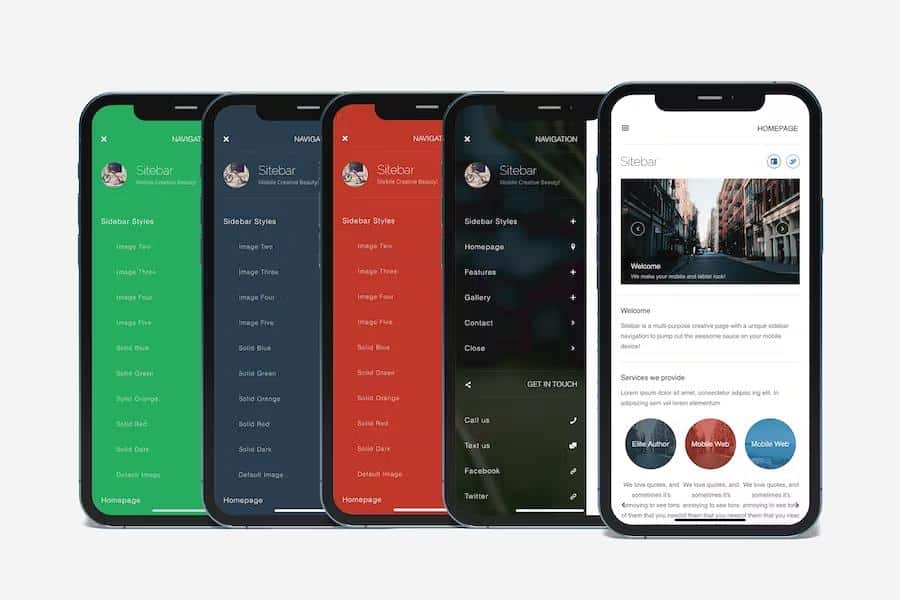
Sitebar Mobile is a template built for phones and tablets, centered around a sidebar that appears when you swipe the screen. This is not a static menu sitting on the edge of the page; it slides in over the content and holds navigation and other controls. Because the whole layout is designed around this gesture, the interface feels responsive and natural on touch screens. Navigation, links, and secondary actions sit inside that panel, keeping the main content area uncluttered and focused on what matters on each page. The template runs on plain HTML, CSS, and JavaScript, so there is no heavy framework to learn or maintain. It works as a standalone site template and includes a collection of ready-made pages you can adapt directly. The sidebar itself supports multiple background styles, which we will get into shortly. Everything is built for small screens first, which means the layout, typography, and touch targets are sized appropriately for mobile use.
A standout feature is the way Sitebar handles sidebar backgrounds. You can use a solid color for a clean look, or an image that fits your branding. More interestingly, the template can harvest a product image from the current page and set it as the sidebar background automatically. So a page showing a red sneaker displays that sneaker behind the navigation, while a page about a blue watch shows the watch in the same spot. This gives every page its own visual identity without custom backgrounds for each one. The approach works well for portfolios, product catalogs, or sites where individual items take center stage. Since the sidebar only appears after a swipe, the image feels like a reveal rather than permanent decoration. It is a simple detail, but it changes how distinct each page feels while using one template. The solid color option stays available for simpler presentations, covering both visual extremes.
For content, Sitebar brings a practical set of layout options. The included pages cover a homepage, contact page, gallery, thumbnail gallery, and portfolio layouts that can be wide or arranged in one, two, or three columns. Beyond those, there is a collection of components for building custom pages: text columns, image columns, icon columns, and responsive media like images, videos, and maps that keep their aspect ratio on any screen size. Styling features include multiple heading styles, dropcaps, highlights, tables, quotes, toggles, accordions, tabs, large and small notifications, form fields, checkboxes, radio buttons, squared and rounded buttons, 3D buttons, and social buttons. On the interactive side, jQuery features take care of page preloading, device detection, CSS3 navigation, accordion and tab controls, sliders for images, quotes, and staff, a share-from-bottom panel, and a pop-up contact form with field validation. Together, these pieces give you a working mobile site structure rather than a bare wireframe.
Related products
 Themeforest
Sitebar Mobile is distributed as a site template, but it does not lock you into a single platform. Because the core is plain HTML, CSS, and JavaScript, you can adapt it for a modern CMS like WordPress or Joomla without rewriting the front end. The same codebase is compatible with Cordova and PhoneGap, so you can wrap it as a native mobile app. If a progressive web app suits your needs, simply attach a manifest.json file and register a service worker, which the structure supports. This flexibility extends to form factors as well; the template works for both phones and tablets, and the layout responds to different screen sizes. There is no proprietary framework hiding in the background, so designers and developers can modify the structure or integrate it into an existing workflow. You are not dependent on a closed system, making Sitebar a dependable starting point for mobile sites, hybrid apps, or web projects that need to run across devices.
- Last updated
- August 2, 2026
- Delivery
- Digital
- Availability
- In stock
- Version
- Latest Version
- Category
- HTML Templates
- Item type
- template
The available listing for Sitebar Mobile places it among HTML Templates products. It is presented here as a template with its supplied description and purchase information.
Usage rights depend on the license selected at checkout. Review the complete terms before using this item for client work, redistribution, SaaS, or more than one end product.