SOHO - Fullscreen Photo & Video WordPress Theme 2.6.5
Wordpress Themes Themeforest 4.8 (1.4K reviews)
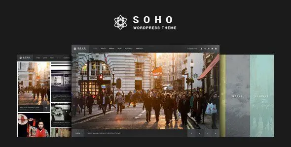
SOHO is a WordPress theme built specifically for photographers, videographers, and visual artists who want their work to occupy the entire screen. Its fullscreen layout places each image and video front and center, eliminating distracting sidebars and clutter so the audience sees nothing but the artwork itself. This product comes from ThemeForest and follows the latest fullscreen layout approach for WordPress. A clean, modern design lets visual content breathe. Custom page templates give you flexibility in how you arrange individual pages, while a dedicated landing page template provides a focused option for single-page presentations. Everything in the theme loads quickly and without unnecessary overhead, and the code base follows contemporary web standards, which matters when you are displaying high-resolution photographs or streaming video. SOHO does not try to be everything at once; it concentrates on doing one thing well, which is presenting your visual work in the most direct, impactful way possible.
Behind the scenes, SOHO relies on the drag-and-drop GT3 Page Builder plugin. This builder lets you construct page layouts visually without touching a line of code. You place elements where you want them, resize them, and see the result immediately. There are more than six hundred options in the advanced theme settings panel, covering everything from global colors to spacing details. Color management is built in, so you can match your site to your brand or to the mood of your portfolio. Google Font support means you are not stuck with a handful of typefaces; a wide range of font choices is available and switching between them takes a couple of clicks. The custom page templates provide ready-made starting points for different kinds of content. A custom landing page option is included as well, which is handy when you want to direct visitors to one specific piece of work or a single campaign rather than a full site.
On the technical side, SOHO is responsive and retina ready, so your images stay crisp on phones, tablets, laptops, and high-density displays. The theme is coded with HTML5 and CSS, following current standards for structure and styling. Performance was a clear priority during development; the theme is built around high speed, which keeps page loads quick even when galleries contain several large files. Search engine considerations were also part of the build, with the code structured in a way that helps search engines read and index your content properly. Translation is handled through standard .po and .mo files, meaning you can localize the interface into your own language without editing templates. This set of capabilities matters for photographers who deliver full-resolution files and for videographers who embed HD clips directly into their posts. All of these parts work together quietly in the background, so your attention stays on the imagery and the visitors' experience rather than on technical maintenance.
For a photographer, filmmaker, or visual artist building an online portfolio, SOHO solves a common problem: how to make photography and video look substantial on the web. Many themes bury media inside sidebars, widgets, and page furniture. SOHO does the opposite. Nothing gets in the way of the images. Every piece of work stretches across the full viewport, which suits landscape shots, wide panoramas, and cinematic video reels. A modern, clean design keeps chrome out of the way, and the included landing page template gives you a focused entry point for specific projects. Because the settings panel covers more than six hundred options, fine-tuning the look of your site does not require a child theme or custom CSS. What you end up with is a portfolio that feels intentional and polished, where the layout supports the work instead of competing with it. That is the entire point of a fullscreen theme, and SOHO carries it through in a straightforward, dependable way.

 Themeforest


- Item type
- theme
- Category
- Wordpress Themes
- Version
- 1.8
- Availability
- In stock
- Delivery
- Digital
- Last updated
- August 10, 2026
Listed under Wordpress Themes, SOHO - Fullscreen Photo & Video WordPress Theme is a theme. This presentation keeps the product name and recorded facts intact while organizing the details for easier review.
Usage rights depend on the license selected at checkout. Review the complete terms before using this item for client work, redistribution, SaaS, or more than one end product.