Stock - E-Commerce Responsive Email Template Latest Version
HTML Templates Themeforest 4.8 (899 reviews)
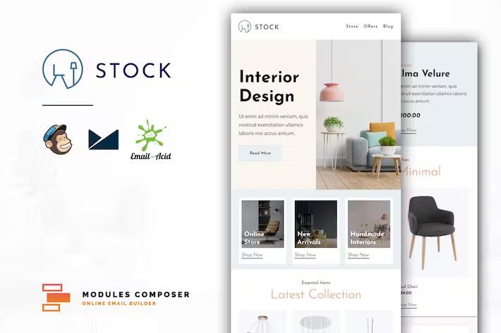
Stock is a responsive email template designed specifically for furniture shops and interior design businesses wanting to promote startups and related services. Twenty pre-designed modules give creators the flexibility to build newsletters tailored to specific design campaigns without needing advanced coding knowledge. Minimalistic aesthetics ensure that visual content, room layouts, and furniture pieces remain the primary focus of every message sent to subscribers. Each individual module provides a distinct layout structure, allowing curators to mix and match sections for product showcases, announcements, and design tips. Clean HTML formatting underpins the entire layout, meaning developers can easily modify the underlying code if they prefer manual adjustments over visual editors. Visual adjustments happen quickly through the included Modules Composer, an online tool dedicated to assembling layouts directly in the browser. Users simply select the desired sections, swap placeholder details with their own brand information, and export the finished creation for immediate deployment. This modular system eliminates the frustration of building messages from scratch while keeping design consistency intact across multiple marketing campaigns.
Compatibility spans more than twenty-five popular email service providers, including major platforms like Mailchimp, Campaign Monitor, Klaviyo, HubSpot, ActiveCampaign, SendGrid, and MailerLite. Native support for these platforms means exported files integrate smoothly with existing subscriber lists and automation workflows without requiring complex workarounds or tedious manual coding adjustments. Standard HTML and ZIP exports are also included for systems that require direct file uploads or custom server setups. Typography styling benefits from access to over nine hundred Google Fonts, giving creators wide latitude to match email headings and body text with existing brand guidelines. Images and icons load from external servers or media libraries by replacing basic URLs, keeping file sizes manageable and delivery speeds fast across recipient inboxes. Background images receive full support, including specific rendering capabilities for Microsoft Outlook clients that traditionally struggle with background styling rules. Every generated layout adapts automatically to different screen dimensions, ensuring that desktop monitors, smartphones, and tablet devices display content clearly.
More from this category
 Themeforest
Retina display support guarantees that graphics and product photography appear sharp and detailed on high-resolution screens without pixelation or blurriness. Testing across a wide range of popular reading environments ensures reliable rendering performance on desktop applications like Apple Mail and Microsoft Outlook, webmail interfaces like Gmail and Yahoo, and mobile apps running on iOS and Android operating systems. Standalone HTML files come packaged alongside dedicated versions prepared specifically for Mailchimp and Campaign Monitor, providing direct paths for users relying on those specific services. Specialized single-file templates are included for platforms utilizing built-in editors, making layout assembly straightforward within those specific ecosystems. Visual assets shown in marketing previews serve demonstration purposes only and remain separate from the core files provided during download. Creators retain full freedom to host their own product photography and promotional graphics using preferred media hosting providers or standard content delivery networks.
Managing textual content and links happens directly within supported editors, allowing marketing teams to update copy, change destination URLs, and adjust spacing rapidly before scheduled sends. The underlying codebase follows industry standards for email design, reducing the likelihood of layout breakage or filtering issues by major spam detectors. Organizations launching interior design newsletters, furniture catalogs, or startup updates find that this template system accelerates production timelines significantly compared to custom design workflows. Structural organization remains predictable across all twenty modules, helping maintain visual harmony even as newsletter lengths change from week to week. Technical documentation included in the package explains how to operate the Modules Composer and connect exported files to chosen distribution platforms. Anyone seeking a dependable foundation for furniture marketing campaigns will find these flexible layouts adaptable to diverse brand aesthetics and publishing schedules.
- Item type
- template
- Category
- HTML Templates
- Version
- Latest Version
- Availability
- In stock
- Delivery
- Digital
- Last updated
- August 2, 2026
Stock - E-Commerce Responsive Email Template belongs to the HTML Templates section and is treated as a template. Its preview, description, and listing facts can be checked without adding claims not found in the source.
Usage rights depend on the license selected at checkout. Review the complete terms before using this item for client work, redistribution, SaaS, or more than one end product.