STUDIO POINT - Parallax Responsive Retina Ready Latest Version
Others Themeforest 4.8 (1.6K reviews)
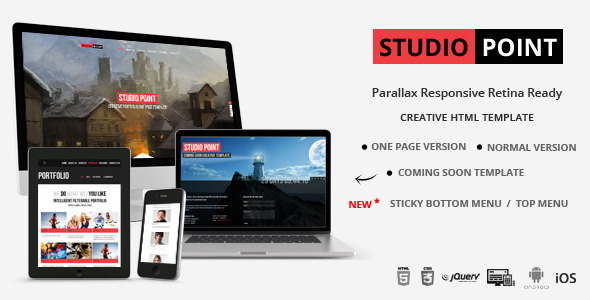
This STUDIO POINT – Parallax Responsive Retina Ready Template is suitable for creative portfolio, photo studio, digital agency, and corporate base website.
It looks great in Desktop, Tablet and Mobile device.
The popular effect parallax is implemented in this template.
Both one page and separate pages versions with two colours of totally FIVE separate folders are available in download file.
History plugin is used in this file so you can bookmark each and every page
It’s very easy to change the template colour by just editing a single color.css file.
All PSD file and Complete Help document is included
Other products to consider
 Themeforest
Features:
- Responsive design
- Menu area can be set to bottom position or fixed top position using sticky plugin
- Parallax effect
- Retina Redy, pixel perfect view in retina device like ipad and iphone
- One page and Separate pages Template are availiable in separate folder
- Option to add Video background
- Combine bark and light color on single html file.
- There are Five separate version is availiabe in downlaod file thery are
Black and White color combination of one page version,
Black color version of one page and separate pages version and
White color version of one page and separate pages version. - Isotope filterable Portfolio and Flexible to show the project details.
- Lazyload for project images. The images are load only when the project display
- Set High and low resolution image for Desktop and Mobile device. so that Mobile devices will load low resolution version of images to gain performance as well as saves download time.
- Full Screen Slide show with Image caption. Option to set High and low resolution image for full screen gallery
- Three variation of Blog post. Open the separate page for single blog post
- Flexslider
- support video and youtube. Option to set video cover image
- Ajax contact form
- Fancybox plug-in
- Easy to change the color
- PSD files included
Code Update
28 Jan 2014
Chrome browser (Version 32.0.1700.76 m) have update on TouchEvent. please replace the below code in custom.min.js file
/* Find touch device */
        try {
            isTouch = true;
            document.createEvent('TouchEvent');
        } catch (e) {
            isTouch = false;
        }
REPLACE TO
/* Find touch device */
        if( /Android|webOS|iPhone|iPad|iPod|BlackBerry|IEMobile|Opera Mini/i.test(navigator.userAgent) ) {
          isTouch = true;
        }
Updated:
25 FEB 2014 – Update Tweeter Feed, minor bug fixed23 MAR 2013 – Option to set Sticky Bottom Menu and Top Menu03 MAR 2013 – Added coming soon page14 FEB 2013 – Replace # tag to #! in url to make search engine friendly13 FEB 2013 – Added video background option
FONT
In this template there are four types of font is used they are.
1. Open Sans – Google font
2. colabreg (Colaborate Regular)- http://www.fontsquirrel.com/fonts/Colaborate
3. Oswald Regular (OswaldRegular) – http://www.fontsquirrel.com/fonts/oswald
4. Bebas neueregular ( bebas_neueregular) – http://www.fontsquirrel.com/fonts/bebas-neue
You can easily change the google font by linking the google font in custom.js file
Sources and Credits
The following Plug-ins are used in this file:
skeleton – http://www.getskeleton.com
History – http://tkyk.github.com/jquery-history-plugin/
jQuery Parallax – http://www.ianlunn.co.uk/plugins/jquery-parallax/
Mouse wheel – http://brandonaaron.net/code/mousewheel/docs
Supersized – http://www.buildinternet.com/project/supersized
FancyBox – http://fancybox.net
isotope – http://isotope.metafizzy.co/
FlexSlider – http://www.woothemes.com/flexslider/
Images credits to :http://www.flickr.com/photos/gordontarpley/http://www.flickr.com/photos/kylelane66/http://www.flickr.com/photos/theilluminated/page2/
If you have any questions about this file contact me through my profile page.
Check out my other files:
- Last updated
- September 23, 2026
- Delivery
- Digital
- Availability
- In stock
- Version
- Latest Version
- Category
- Others
- Item type
- digital product
STUDIO POINT - Parallax Responsive Retina Ready belongs to the Others section and is treated as a digital product. Its preview, description, and listing facts can be checked without adding claims not found in the source.
Usage rights depend on the license selected at checkout. Review the complete terms before using this item for client work, redistribution, SaaS, or more than one end product.