The Way - Responsive Retina Ready Template Latest Version
HTML Templates Themeforest 4.8 (3.2K reviews)
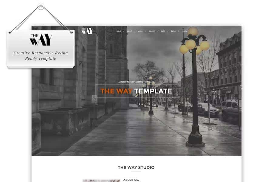
The Way is a fully responsive and retina-ready website template designed for creative professionals who want to showcase their portfolios online. Built using modern HTML5 and CSS3 standards, this layout adapts smoothly to various screen sizes and high-resolution displays. Visitors viewing your site from mobile phones, tablets, or desktop monitors experience sharp imagery and properly scaled elements. Clean code forms the foundation of the entire package, ensuring that your pages load efficiently across different web browsers. Google Fonts support comes integrated out of the box, allowing you to easily adjust typography to match your personal brand or agency identity. Every visual component is crafted with attention to detail, creating a polished environment for displaying photography, design work, and creative projects. Setting up the files requires minimal effort, making the template accessible even if you prefer working directly with the source code rather than complex content management systems. You receive a structured directory of files that you can host on any standard web server immediately after minor customizations to text and images.
Similar products
 Themeforest
Homepage presentation options give your visitors a strong first impression through dynamic visual storytelling elements. A premium full-screen slider comes bundled into the package, letting you present large background images and promotional messages smoothly right when the audience arrives. If you prefer motion backgrounds, the integrated video display on scroll effect creates an engaging transition as users move down the page. Beyond the standard landing page configurations, you get access to a scattered polaroids gallery that mimics physical photographs laid out randomly across a surface. An elastic stack layout incorporates interactive dragging mechanics, inviting your audience to physically manipulate stack elements with their mouse or touch input. These distinct interface interactions move away from traditional static grids, giving your online portfolio a memorable personality that stands out from standard corporate websites. Each motion effect functions smoothly within the browser, relying on standard web animations that do not require heavy plugins or complicated configuration steps from you.
Portfolio management forms a core part of the template, providing dedicated spaces to display your creative output in organized layouts. You can present individual projects using unique visual effects that capture attention and guide viewers through your past work naturally. The package includes the entire Font Awesome icon library alongside more than four hundred additional vector icons, giving you plenty of visual symbols for navigation menus, social links, and contact details. Icons scale perfectly on retina screens just like the photography and typography, maintaining crisp edges at any pixel density. Organizing your project galleries takes very little time because the underlying code structure keeps everything neat and modular. You simply replace the placeholder content with your own project descriptions, categories, and media files. Visitors can browse your portfolio items without experiencing long delays or clunky page reloads, keeping their focus entirely on the creative work you have published on the screen.
Communication features include a working PHP contact form that arrives pre-configured for your visitors to send messages directly from the site. This form processes inquiries without requiring complex server-side scripting knowledge from you, handling message delivery securely in the background. Valid HTML5 code backs every template file, ensuring your site adheres to web standards and maintains stable performance across major browsers like Chrome, Firefox, Safari, and Edge. Cross-browser compatibility testing means you do not have to worry about layout bugs appearing unexpectedly for users on different operating systems. Typography, spacing, and interactive elements remain consistent whether the site is accessed from a Windows desktop or an Apple mobile device. By combining flexible layout options with reliable backend communication tools, this template provides a complete foundation for building a professional online portfolio without unnecessary bloat or complicated setup procedures.
- Item type
- template
- Category
- HTML Templates
- Version
- Latest Version
- Availability
- In stock
- Delivery
- Digital
- Last updated
- August 17, 2026
The Way - Responsive Retina Ready Template is listed in HTML Templates as a template. The supplied description, preview, version, price, and recorded product details are collected here for review.
Usage rights depend on the license selected at checkout. Review the complete terms before using this item for client work, redistribution, SaaS, or more than one end product.