Breek - News & Magazine Mobile Template Latest Version
HTML Templates Themeforest 4.8 (1.6K reviews)
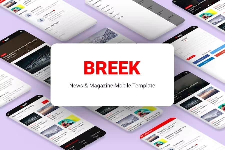
Breek is a mobile template built for news websites, online magazines, and blogs. It gives you a structured layout that handles breaking stories, long-form articles, opinion pieces, photo essays, and community submissions with equal ease. The design prioritizes readability, so you get clear typography, generous spacing, and distinct zones for headlines, images, and body text. While it is created with mobile screens in mind, the responsive grid scales up neatly for tablets and desktop browsers. Navigation stays simple and thumb-friendly, which means readers can swipe through sections, open the menu, and jump to the next story without hunting for tiny buttons. You also have multiple home page layouts to choose from, along with several post arrangements, so the template adapts to your editorial style instead of forcing you into one rigid format. Solo bloggers collecting their thoughts and small teams publishing daily news both get a foundation with room to grow.
On the page side, Breek comes with a substantial set of screens. The main content areas include a standard home, a grid-based home, and a blog home, which let you present recent articles in different rhythms. Single post layouts come in two flavors, one for text-heavy pieces and one that highlights a gallery with photos. Search results and author pages give readers a way to browse by query or contributor. Beyond those core templates, the package contains a long list of utility pages. Accordions, buttons, calendars, cards, collapse sections, lists, pagination, tables, and tabs are all designed as standalone examples you can drop into posts or static pages. You also get a pricing table, a not-found page, settings screens, sign up and sign in forms, a team page, a contact form, an about page, a gallery, and a credits screen. This variety means you rarely need to build a layout from scratch; you can grab the right component and adapt it.
Other products to consider
 Themeforest

Under the hood, Breek relies on a familiar set of web technologies. The markup is valid HTML5, and the styles are valid CSS3, which keeps the template clean and easier to inspect if you want to change something. JavaScript is handled through jQuery, and the template includes several well-known libraries for shared functionality. Owl Carousel manages sliding image galleries, Magnific Popup handles lightbox-style image viewing, and the built-in Lightbox component covers simple photo enlargement. The layout uses Materializecss as its CSS framework, giving you a grid system and reusable UI components that follow the Material design language. Icons come from Font Awesome, while the text is set with Google Fonts. Sample imagery is provided through Pexels, so you can see how photos look inside the design before replacing them with your own. Because the code is organized in a straightforward way, you do not need deep expertise to trace how a page is assembled or where to adjust a color.
Customization starts with a set of options that let you adjust the look without rewriting the source. Common changes, like swapping fonts, replacing colors, or uploading your own logo, are handled through the CSS structure and the included documentation. That same documentation walks you through file organization, how to edit specific sections, and where to find the key variables. If you run into something you cannot figure out, the free support channel is there to answer questions. Breek is not a website builder or a CMS plugin; it is a static HTML template. You can use it as-is by editing the files directly, or you can integrate it with the backend of your choice. Every page is self-contained, which keeps the setup straightforward for anyone with basic HTML and CSS familiarity. From there, the template gives you room to shape it into a news site or magazine that feels like yours.
- Last updated
- August 15, 2026
- Delivery
- Digital
- Availability
- In stock
- Version
- Latest Version
- Category
- HTML Templates
- Item type
- template
The Breek - News & Magazine Mobile Template listing is available in HTML Templates as a template. Check the description, item facts, and purchase details to assess its relevance to a project.
Usage rights depend on the license selected at checkout. Review the complete terms before using this item for client work, redistribution, SaaS, or more than one end product.