Supermarket - Responsive MultiPurpose HTML 5 Template (Mobile Layouts Included) Latest Version
HTML Templates Themeforest 4.8 (3.8K reviews)
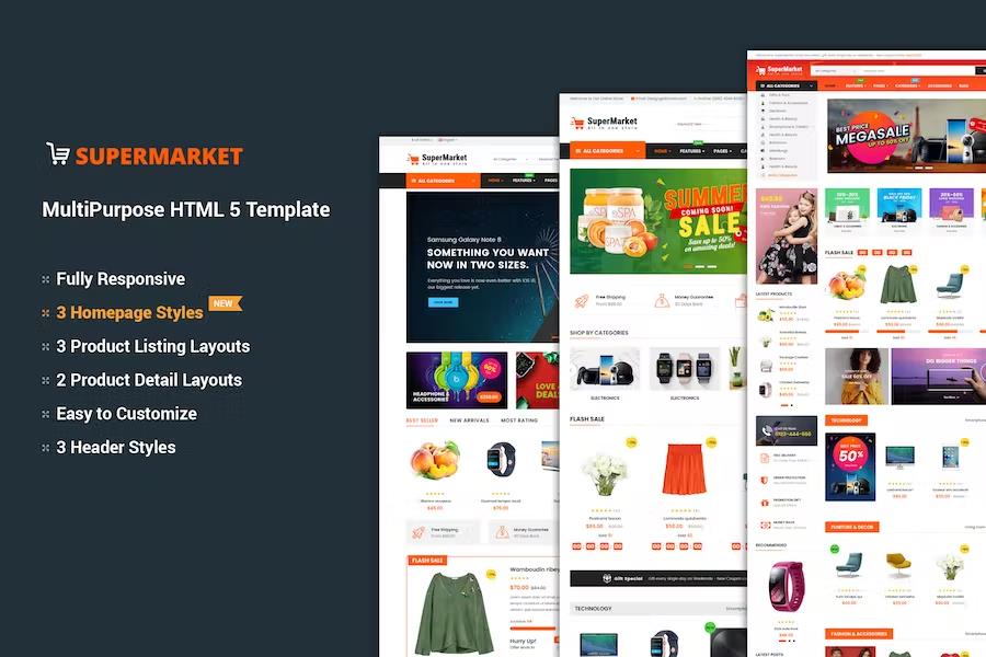
Supermarket is a responsive multipurpose HTML5 template designed specifically for building online retail stores. Built on the Bootstrap 3 framework, the package provides a solid structural foundation for web developers and store owners who want to establish a professional digital storefront. The codebase integrates Compass and CSS for styling, offering clean and valid markup throughout all included pages. Designers and developers find the template layout easy to adapt because the package contains fully layered PSD files alongside the standard HTML5 and CSS3 documents. Projects benefit from cross browser optimization, ensuring that visitors experience consistent rendering across different internet browsing applications on desktop computers, tablets, and mobile devices. Three distinct pre-made homepage layouts give users immediate visual options for structuring their main landing page. Each homepage design maintains a modern and clean aesthetic suitable for groceries, electronics, clothing, or general merchandise shops. Navigation tools such as a mega menu and a mega vertical menu help structure extensive product categories clearly so shoppers find items quickly. Flexible configuration options allow site administrators to modify the presentation to match specific branding requirements without starting development from scratch.
Related products
 Themeforest


Shoppers browsing an online store built with this template interact with practical features designed to improve product discovery and purchase decisions. Grid and list view options let users display items according to personal preference on category pages. Three different category page styles and two distinct product page styles provide structural variety for displaying merchandise catalogs. Product quick view functionality enables visitors to inspect item details in a pop-up window without leaving the current catalog page. Carousel sliders powered by Owl Carousel showcase featured products, promotional items, or bestsellers in dynamic visual rotations. Free fonts and icons are included to support typography and interface design elements across the site. Every page layout adapts to various screen dimensions automatically, providing a functional viewing experience on smartphones and small screens because mobile layouts are built right into the template architecture. These layout adaptations ensure that touch navigation functions smoothly for mobile shoppers browsing on the go.
Setting up a new project using this template involves working with organized files and documented code structures. The development files separate styling, scripting, and markup logically so technicians can locate specific elements quickly during customization. Standard HTML5 semantic tags structure the content for better code readability and maintenance over time. Styling rules use CSS to control visual presentation, allowing color schemes and spacing adjustments through stylesheet edits. Asset folders contain the necessary graphic resources, icon sets, and script dependencies required for the interactive features to operate properly. Developers familiar with standard front-end workflows can integrate these templates into custom back-end systems, content management platforms, or static site generators depending on project requirements. The absence of strict platform dependencies means the HTML template serves as a front-end interface layer for various e-commerce backends requiring a customized visual presentation.
Visual presentation heavily emphasizes merchandise display through balanced spacing and clear typography. Product imagery takes center stage within the layouts, supported by minimalist framing that reduces visual clutter on shopping pages. Header areas accommodate brand logos, search bars, account links, and shopping cart indicators in predictable locations that online buyers recognize instantly. Footer sections provide space for secondary navigation links, payment method badges, newsletter signup forms, and copyright notices. The template design prioritizes readability by using high-contrast text colors against clean backgrounds. Developers modifying the templates can adjust these color pairings easily by editing the main stylesheet variables. Consistent padding and margin rules maintain alignment across all included subpages, creating a unified user experience from the homepage through category listings down to individual product details and checkout processes. The resulting website presents a professional storefront appearance suitable for commercial retail operations of varying sizes.
- Last updated
- August 17, 2026
- Delivery
- Digital
- Availability
- In stock
- Version
- Latest Version
- Category
- HTML Templates
- Item type
- template
Supermarket - Responsive MultiPurpose HTML 5 Template (Mobile Layouts Included) is one of the HTML Templates items recorded as a template. The content below uses the supplied listing information and current local catalog data.
Usage rights depend on the license selected at checkout. Review the complete terms before using this item for client work, redistribution, SaaS, or more than one end product.