Archits - Responsive Architecture Template Latest Version
HTML Templates Themeforest 4.8 (1.3K reviews)
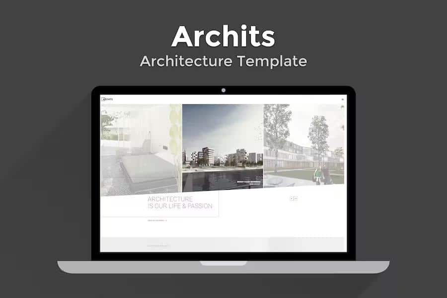
Archits serves as a specialized HTML template built for architects, interior decorators, and exterior design professionals who need a professional digital presence. This package provides a clean, minimal aesthetic that keeps the focus entirely on your visual portfolio. Because it is built using the Bootstrap 3 framework, the code maintains a solid structure that adapts across different screen sizes, ensuring your images and project descriptions look sharp on desktop monitors, tablets, and phones. The design philosophy centers on simplicity, allowing your creative work to speak for itself without unnecessary visual clutter or distracting animations. You get access to a variety of layout options that help you display your sketches, blueprints, and finished building photographs in a clean, organized manner. By using this template, you establish a professional identity that conveys your attention to detail and design sensibility, which is essential for attracting new clients in the highly competitive fields of architecture and construction.
You have access to twelve distinct homepage variations, each offering a unique way to introduce your firm or personal design brand. These options range from full-screen image displays to grid-based layouts, giving you the flexibility to choose the style that best matches your professional personality. Both light and dark color themes are included, allowing you to toggle the mood of your site based on the specific aesthetic of your photography or design work. The dark mode provides a sophisticated, high-contrast look that often makes architectural photography pop, while the light mode offers a crisp, airy feel that works well for clean, modern interior spaces. Switching between these modes is straightforward, ensuring that your final website feels tailored to your unique tastes. Every page is crafted to load quickly and display content clearly, helping you maintain a high standard of quality for your online visitors as they browse through your past projects.
Related products

 Themeforest
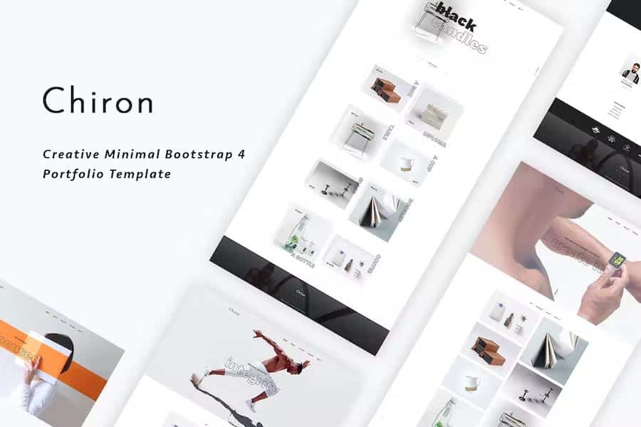

Showing your work effectively requires more than just a gallery, which is why this template includes three specific project detail page variants. These templates allow you to present case studies with depth, providing space for descriptions, technical specifications, or client notes alongside your high-resolution images. You can choose the layout that best emphasizes the story of each build, whether that involves highlighting structural nuances or the fine details of a furniture design. By utilizing these structured pages, you provide potential clients with a clear understanding of your process and capabilities. The template structure ensures that your imagery remains the primary focus, preventing navigation elements or text blocks from overwhelming the viewer. This organized approach helps you guide visitors through your professional history while maintaining a consistent visual language across your entire site, which is vital for building trust with individuals or organizations looking to hire your design services.
Communication stays central to your business, so the template includes a functional contact form that integrates directly into your site. Visitors can reach out to you with inquiries about potential projects, consultations, or general questions without leaving your platform. This form is designed to capture essential information from prospective clients, making it easier for you to manage incoming requests efficiently. Because the template is written in standard HTML, you can modify the code to suit your specific hosting environment or server requirements. You have complete control over how your information is presented, as the files are organized logically for easy editing and customization. Whether you are an independent designer showcasing your latest furniture concepts or a larger agency presenting a portfolio of exterior building designs, this template provides a reliable foundation. It offers the necessary structural elements to build a professional website that highlights your creative talents and design expertise.
- Last updated
- September 25, 2026
- Delivery
- Digital
- Availability
- In stock
- Version
- Latest Version
- Category
- HTML Templates
- Item type
- template
Archits - Responsive Architecture Template is listed in HTML Templates as a template. The supplied description, preview, version, price, and recorded product details are collected here for review.
Usage rights depend on the license selected at checkout. Review the complete terms before using this item for client work, redistribution, SaaS, or more than one end product.