Kutcher Studio - Responsive Parallax Template Latest Version
HTML Templates Themeforest 4.8 (1.5K reviews)
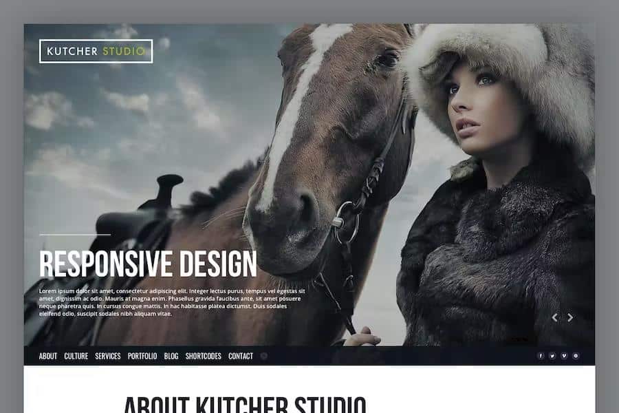
Kutcher Studio serves as a single-page template built upon a grid system, designed specifically for creative professionals, digital agencies, and independent freelancers who need a polished online presence. This digital asset provides the structure required to display photographic portfolios or business services in a clear, organized fashion. By focusing on a minimalist layout, the template ensures that your visual content remains the primary point of interest for every visitor. The design relies on clean HTML5 and CSS3 code, providing a stable foundation that remains consistent across different web browsers. Because it follows a single-page architecture, your audience can view all your essential information without needing to click through multiple sub-pages. This approach simplifies the browsing experience, keeping potential clients engaged as they scroll vertically through your work. If you need a reliable framework to establish a professional identity, this template offers the necessary tools to organize your digital portfolio effectively.
A central feature of this template is the parallax scrolling effect, which adds a sense of depth and movement to your site as users move down the page. This visual technique creates a multi-layered appearance that makes the transition between sections feel fluid and intentional. You also get a built-in fullscreen slider, which acts as a prominent display area for your most important images or project highlights. This slider occupies the initial viewport, immediately capturing attention upon arrival. By combining these motion elements, the template creates a modern aesthetic that feels dynamic rather than static. The underlying skeleton grid system keeps every element precisely aligned, ensuring that your text, buttons, and media galleries maintain their intended proportions regardless of the device being used. These components work together to provide a visually engaging interface that highlights your creative output while maintaining a high standard of professional presentation for all your visitors.
Similar products
 Themeforest

Responsiveness is a core requirement for any modern website, and this template adapts its layout to look correct on desktops, tablets, and smartphones. The design automatically adjusts its grid structure to accommodate narrower screens, preventing images from breaking or text from becoming unreadable. Because it is built with flexible CSS rules, the site remains functional and legible on various screen sizes without requiring separate mobile versions or complex coding adjustments. You can trust that the visual hierarchy will remain intact, ensuring that your contact information and portfolio pieces stay accessible to everyone. This technical flexibility is crucial for freelancers who cannot predict which device a potential client might use to view their work. By prioritizing a fluid design, the template avoids the common pitfalls of rigid layouts, allowing your project descriptions and imagery to scale gracefully while preserving the intended user experience across the entire spectrum of modern internet-enabled hardware.
The package includes a layered PSD file, which gives you the ability to customize the visual design of the template within Adobe Photoshop before you begin your development process. This allows you to experiment with color schemes, typography, and layout adjustments to better match your existing brand identity. You can manipulate individual elements within the file to refine the look of your buttons, forms, and navigation links. Once you are satisfied with your custom design, you can translate those changes into the provided HTML and CSS code. Having access to the original source files ensures that you are not locked into the default appearance, providing a level of control over the final aesthetic of your site. This workflow is helpful for those who want to maintain a specific visual theme throughout their digital presence. Every component is structured to support a straightforward customization process, resulting in a unique site that represents your specific professional requirements.
- Last updated
- September 18, 2026
- Delivery
- Digital
- Availability
- In stock
- Version
- Latest Version
- Category
- HTML Templates
- Item type
- template
Kutcher Studio - Responsive Parallax Template appears in the HTML Templates catalog and is classified as a template. The page focuses on information available in the listing rather than unsupported performance or compatibility claims.
Usage rights depend on the license selected at checkout. Review the complete terms before using this item for client work, redistribution, SaaS, or more than one end product.