Materialish Mobile Latest Version
HTML Templates Themeforest 4.8 (4.7K reviews)
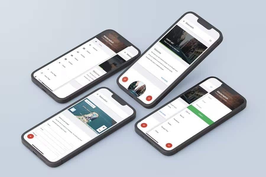
Materialish Mobile provides a structured set of web templates designed specifically for mobile devices using current design principles. This package functions as a foundation for building mobile websites, application interfaces, or digital projects that require a clean and organized appearance. The core structure relies on responsive layouts that adapt to various screen sizes, ensuring that content remains readable and functional on both smartphones and tablets. By incorporating a sidebar navigation system, the template prioritizes ease of use, allowing visitors to move through different sections of your site without confusion. Every element within this collection is built to be touch-friendly, which means buttons and interactive components are sized appropriately for finger navigation rather than precise mouse clicks. This approach ensures that your final project feels natural to users who are accustomed to modern smartphone interfaces, providing a consistent look and feel across different mobile operating systems and various hardware configurations found in today’s diverse market.
Technical performance is a primary focus of this template, evidenced by the inclusion of features that prioritize speed and efficiency. The integration of lazy loading for images helps reduce initial page load times, which is essential for maintaining user engagement on mobile networks. You will find built-in support for fast-click functionality, eliminating the delay that often occurs when a user taps a button on a mobile screen. The code includes a contact form powered by PHP and Ajax, which handles data validation to ensure that submissions are processed correctly and securely. Additionally, the template supports PhoneGap and Cordova, making it a viable starting point if you intend to package your web content into a native application container. By including high-definition graphics and retina-ready assets, the design ensures that text and icons remain sharp on high-resolution displays, providing a professional visual experience that avoids the pixelation often seen on less optimized mobile designs.
Similar products
 Themeforest
The visual customization options allow you to tailor the appearance of your project to suit specific branding needs or aesthetic preferences. With eight distinct color schemes available for various elements, you can modify the primary look of your interface without needing to rewrite the underlying code. The package includes over four hundred resizable icons sourced from Font Awesome, giving you the flexibility to represent different actions and features with clear, recognizable symbols. Typography is handled through Google Fonts, ensuring that text displays cleanly on all devices. You can also utilize various CSS3 components such as 3D, squared, or rounded buttons, and different notification styles to communicate alerts to your users. These tools are arranged to provide a consistent design language throughout your project, helping you maintain a professional aesthetic while having enough variety to distinguish different sections or specific pieces of content within your mobile-friendly website or web application.
Functionality extends beyond basic page layouts by incorporating several interactive components powered by jQuery and CSS3. You have access to various sliders for images, quotes, or staff profiles, which help present information in a compact, scrollable format. Navigation is augmented with toggles, accordions, and tabs, which are useful for hiding or showing content based on user interaction, thereby saving valuable screen space. The template also features responsive elements for maps, videos, and images, ensuring that media content maintains its correct aspect ratio regardless of the device width. Whether you are building a simple landing page or a more complex site, these pre-configured elements reduce the amount of time spent on foundational coding. By combining these interactive widgets with the provided layout structure, you can create a cohesive experience that feels like a polished mobile application while remaining fully compatible with standard web browsers across all modern mobile platforms.
- Last updated
- September 18, 2026
- Delivery
- Digital
- Availability
- In stock
- Version
- Latest Version
- Category
- HTML Templates
- Item type
- template
Listed under HTML Templates, Materialish Mobile is a template. This presentation keeps the product name and recorded facts intact while organizing the details for easier review.
Usage rights depend on the license selected at checkout. Review the complete terms before using this item for client work, redistribution, SaaS, or more than one end product.