Purasa - Responsive Mobile Template Latest Version
HTML Templates Themeforest 4.8 (1.1K reviews)
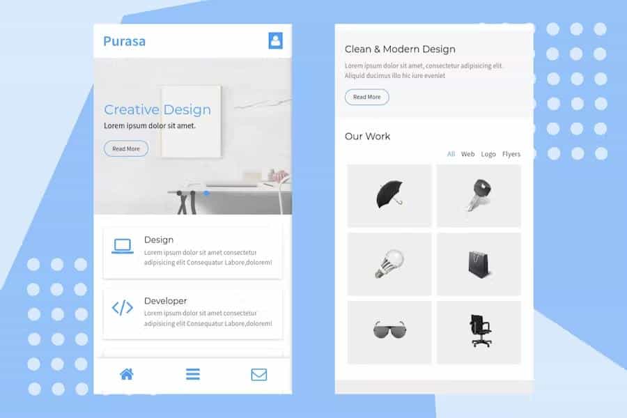
Purasa is a flexible mobile template built to provide a clean and professional foundation for various types of websites. This digital asset focuses on a modern visual aesthetic that adapts to smaller screens, ensuring your content looks sharp on smartphones and tablets. Because the layout is inherently responsive, it automatically adjusts its dimensions based on the specific device used by your visitors. You can apply this template to a wide range of projects, including creative home pages, online storefronts, personal blogs, or digital portfolios. The code base remains lightweight, which helps the site maintain a professional appearance while avoiding unnecessary clutter. By prioritizing a straightforward design philosophy, the template allows you to display your images, text, and interface elements without fighting against a restrictive or overly complicated framework. It serves as a solid starting point for users who want to build a mobile-first presence without starting from scratch on their own custom code.
Customization plays a major role in how this template functions for different users. You have the ability to modify the visual style and structural elements to better align with your specific branding requirements or project goals. The files include documentation that explains how the various components are put together, which assists you in making adjustments to the layout or color schemes. Since the template uses standard web technologies, anyone familiar with basic styling can change the look and feel of the pages quite easily. You will find that the structure is organized in a way that makes locating specific sections simple, reducing the time spent hunting through hundreds of lines of code. This approach grants you significant control over the final output, allowing you to tweak individual modules or global styles as your site evolves. You are not locked into a rigid design that prevents you from expressing your unique visual identity.
Functionality remains a priority within this package, as it includes several essential features needed for a standard mobile website. A working contact form is integrated directly into the template, providing a clear path for your audience to reach out with questions or comments. You also get access to a portfolio filter, which helps organize your visual work so that visitors can sort through items by category or type. For those interested in commerce or content publishing, the shop and blog layouts offer pre-built structures that handle product listings and article feeds effectively. The inclusion of Font Awesome icons allows you to add recognizable visual cues throughout your site without needing to source your own imagery. These features are baked into the template to ensure that your site is ready for deployment shortly after you finish the necessary configuration steps for your specific host environment or backend setup.
Other products to consider
 Themeforest
Maintaining a high standard of visual clarity ensures that your site remains readable and engaging for anyone browsing on the go. The design choices made throughout the template favor white space and readable typography, which are crucial for mobile usability where screen real estate is limited. Because the template is focused on a mobile-first approach, it handles touch interactions and vertical scrolling quite naturally. You will not find excessive animations or heavy scripts that might slow down the experience on older devices or slower network connections. This focus on performance helps keep your site accessible and reliable. Whether you are building a professional showcase for your photography, setting up a small shop to sell goods, or starting a personal blog, this template offers the structural support required to get your content online quickly. It acts as a reliable scaffold, allowing you to focus your energy on creating content rather than fixing layout issues.
- Item type
- template
- Category
- HTML Templates
- Version
- Latest Version
- Availability
- In stock
- Delivery
- Digital
- Last updated
- September 18, 2026
For shoppers browsing HTML Templates, Purasa - Responsive Mobile Template is recorded as a template. The page below separates supplied product information from general store and license terms.
Usage rights depend on the license selected at checkout. Review the complete terms before using this item for client work, redistribution, SaaS, or more than one end product.