Small - Minimal Mobile Template Latest Version
HTML Templates Themeforest 4.8 (4.7K reviews)
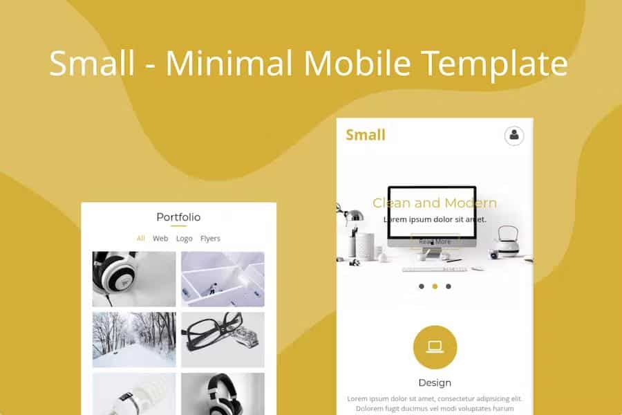
The Small Minimal Mobile Template functions as a foundational web layout specifically engineered for handheld devices. This digital asset provides a structured framework that creators can apply to various mobile-focused projects, including personal portfolios, digital storefronts, and blogging platforms. By prioritizing a stripped-back aesthetic, the template removes unnecessary visual clutter, allowing the primary content to remain the central focus of the user experience. The underlying architecture relies on a clean codebase, which helps maintain stability across different mobile browsers and screen sizes. Developers who prefer a lightweight starting point will find this structure useful because it avoids heavy bloat, keeping the initial load times efficient for visitors. Because the design follows a minimalist philosophy, it adapts well to different branding requirements, offering a neutral backdrop that does not interfere with specific color palettes, custom typography choices, or unique imagery that you might decide to integrate into your final mobile project configuration.
Flexibility serves as the core utility of this template, as it avoids locking users into a rigid niche or specific industry aesthetic. You can repurpose the layout for a simple landing page, a gallery, or an informational site without needing to strip away complex pre-built elements. The responsive nature of the files ensures that the layout adjusts its proportions based on the device width, preventing horizontal scrolling or awkward alignment issues on smaller smartphone screens. This responsiveness is baked directly into the CSS, meaning the grid system naturally reflows content blocks to maintain readability. Since the template includes a functional contact form, you gain a ready-to-use method for receiving inquiries directly from your mobile visitors. This specific component is pre-configured to handle data transmission, saving you the effort of writing custom scripts from scratch. The inclusion of Font Awesome icons further aids in visual communication without requiring heavy image assets.
Customization remains straightforward because the template relies on standard web practices rather than proprietary drag-and-drop builders. You gain full access to the source files, which allows you to modify the cascading style sheets and markup to match your specific vision. Because the code is organized logically, identifying the correct sections to change or update is a direct process for anyone familiar with basic HTML and CSS. You are not forced to wrestle with hidden layers or dense, undocumented scripts that often complicate standard web development tasks. Instead, the focus remains on providing a clean environment where your adjustments take effect immediately. This transparency in the development environment ensures that you retain complete control over the final appearance of your mobile interface. By keeping the technical overhead low, the template allows you to concentrate your creative energy on refining the actual content rather than troubleshooting complex page structures or broken layout containers.
Documentation accompanies the template to clarify how these various components interact and how you can make minor adjustments to the layout. This resource acts as a reference guide, outlining the folder structure and explaining how to link your CSS files or manage the contact form validation settings. You will find that the setup process is intended to be fast, enabling you to deploy a functioning mobile presence with minimal configuration time. The design relies on high-contrast elements and generous spacing to ensure that touch targets remain accessible on touchscreens. By utilizing this template, you establish a reliable baseline that functions predictably on modern mobile hardware. Every part of the package aims to support a clean, professional output that presents your information clearly to a mobile audience. It serves as a practical tool for anyone who needs a quick, stable, and adaptable mobile layout that prioritizes functional simplicity over unnecessary stylistic distractions or heavy script dependencies.
 Themeforest

- Last updated
- September 25, 2026
- Delivery
- Digital
- Availability
- In stock
- Version
- Latest Version
- Category
- HTML Templates
- Item type
- template
Small - Minimal Mobile Template is cataloged as a HTML Templates under template. Review the preview and recorded details alongside the original description before purchase.
Usage rights depend on the license selected at checkout. Review the complete terms before using this item for client work, redistribution, SaaS, or more than one end product.